


The Fastest
Path to AI Value
The AI Platform That Lets You Focus on Tangible Business Outcomes, Not Infrastructure.


Spring ‘24 Launch Event
Confidently Deploy and Govern Generative AI Solutions
May 2, 9am PT/12pm ET (45 mins)


DELIVER VALUE
DataRobot Generative AI Catalyst Program
Build lasting generative AI capabilities across your organization, customized to your needs.
Complimentary Gartner® Report
How to Choose an Approach for Deploying Generative AI
A Report on Choosing the Right Deployment Approach to Ensure AI Governance and Unlock Generative AI Value.


Free 30 Day Trial
Less Friction.
More AI.
Start in Seconds. Train and Tune in Minutes. Deploy in Moments.


Real-World Value
Baptist Health South Florida Applying Generative AI Successfully and Safely
Leading Organizations Trust DataRobot.
Explore Customer StoriesDATAROBOT AI PLATFORM
One Unified Platform for Generative and Predictive AI
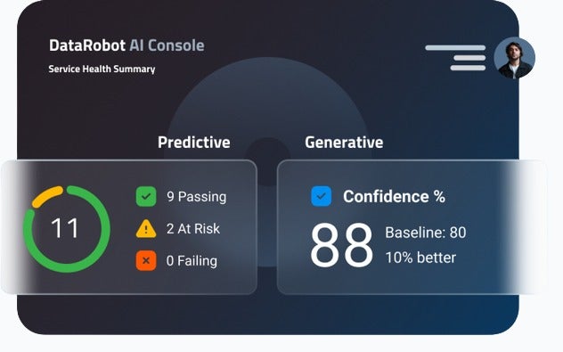
Operate with Confidence
Confidently scale AI and drive business value with unparalleled enterprise monitoring and control.
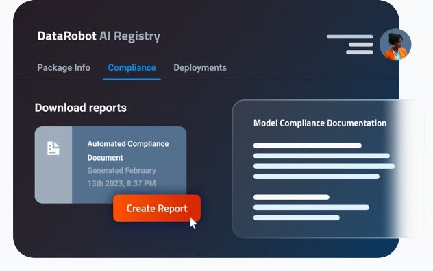
Govern with Full Visibility
Unify your AI landscape, teams, and workflows for full visibility and oversight at scale.
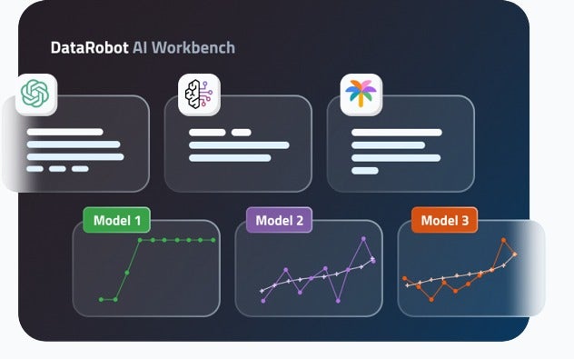
Build with Agility
Innovate rapidly with an open AI ecosystem that gives you the freedom to adapt as needs evolve.
83%
Faster Deployment
4.6X
Return on Investment
80%
Lower Cost
Enterprise Strategy Group (ESG), a division of TechTarget
DEEP ECOSYSTEM INTEGRATIONS
The Most Open AI Platform to Build, Scale, and Adapt with Ease
Explore the DataRobot Difference

The digital marketing solution provider for Ford Dealers and Lincoln Retailers turned to the DataRobot AI Platform to shorten the time to understand customers and prospects, enabling highly personalized touchpoints. The highest-scored leads are 18X more likely to buy a vehicle.

In its mission to support affordable, adequate housing, Freddie Mac has applied AI to more than double its analytics productivity—enabling data scientists to scale.

When a leading Turkish cement maker turned to AI for process optimization, the company identified and rolled out improvements that reduced cost, and most importantly, brought down CO2 emissions nearly 200,000 tons per year.

84.51° is a retail data science, insights and media company. They help the Kroger company, consumer packaged goods companies, agencies, publishers and affiliated partners create more personalized and valuable experiences for shoppers across the path to purchase.
Powered by cutting edge science, they leverage 1st-party retail data from over 62 million U.S. households to fuel a more customer-centric journey utilizing 84.51° Insights, 84.51° Loyalty Marketing, and our retail media advertising solution, Kroger Precision Marketing.

The recently formed Data Science and AI (DSAI) innovation team at BSI turned to DataRobot to deliver value quickly, helping clients and colleagues across the organization to identify and enable data-driven digital transformation opportunities in a trusted way.
1 million+
AI projects successfully delivered across a wide range of industries
1000+
customers served, including Fortune 50 companies
10+ years
of platform innovation and real-world
use-case experience
-
 “The generative AI space is changing quickly, and the flexibility, safety and security of DataRobot helps us stay on the cutting edge with a HIPAA-compliant environment we trust to uphold critical health data protection standards. We’re harnessing innovation for real-world applications, giving us the ability to transform patient care and improve operations and efficiency with confidence”
 -
“DataRobot is an indispensable partner helping us maintain our reputation both internally and externally by deploying, monitoring, and governing generative AI responsibly and effectively.”
-
“DataRobot is the leading technology company and platform innovator that brings predictive and generative AI capabilities together with the governance, observability, and security we need at scale.”
-
 “DataRobot has been instrumental as we work through our generative and predictive AI use cases. With DataRobot’s LLM operations (LLMOps) capabilities and out-of-the-box LLM performance monitoring, we’re equipped to implement cutting-edge generative AI techniques into our business while monitoring for toxicity, truthfulness and cost.”
 -
 “A complete AI lifecycle platform is invaluable in optimizing the effectiveness and efficiency of our growing data science team. The DataRobot AI Platform provides full flexibility to integrate within our current ecosystem, including pulling data directly from Microsoft Azure to save time and reduce risk, and providing insights through Microsoft Power BI. This flexibility drew us to DataRobot, and we look forward to leveraging the integration with Azure OpenAI to continue to drive innovation.”
ANALYST REPORTS
Recognized As a Leader By Industry Experts